Mahaana
Investing starts with questions, not money.
Is it halal? Can I withdraw it? Where does my money actually go? Designing Mahaana meant helping people answer those questions and feel ready to make their first investment.
My role
I led product design for Mahaana’s iOS and Android apps, covering onboarding, investment selection, portfolio tracking and the design system. I worked with the founder, a product manager and a mobile engineer, and mentored a junior designer.
Mahaana is Pakistan’s first digital-only asset management company, licensed by the SECP and backed by Y Combinator, IGI Holdings and Vostok Emerging Finance. It brings Shariah-compliant financial products into one app, with client money held by the Central Depository Company.
Services
Team
No branch. Plenty of questions.
For someone used to keeping savings in gold or a bank account, an investment app asks for a change in behaviour. Before entering their CNIC or choosing a fund, they need to understand who holds their money, what risk they are taking and how to withdraw it.
- “Is this like a bank account?”
- “But is it halal?”
- “Don't I need lakhs to start?”
- “Can I get it out when I need it?”
- “The last app I tried, I gave up halfway.”
- “Where does my money actually go?”
The app had to make those answers accessible throughout the journey. Risk profiling, identity verification and CDC account creation were required. My job was to make those steps understandable and manageable, while keeping customers clear about what they were signing up for.
Making onboarding easier to finish
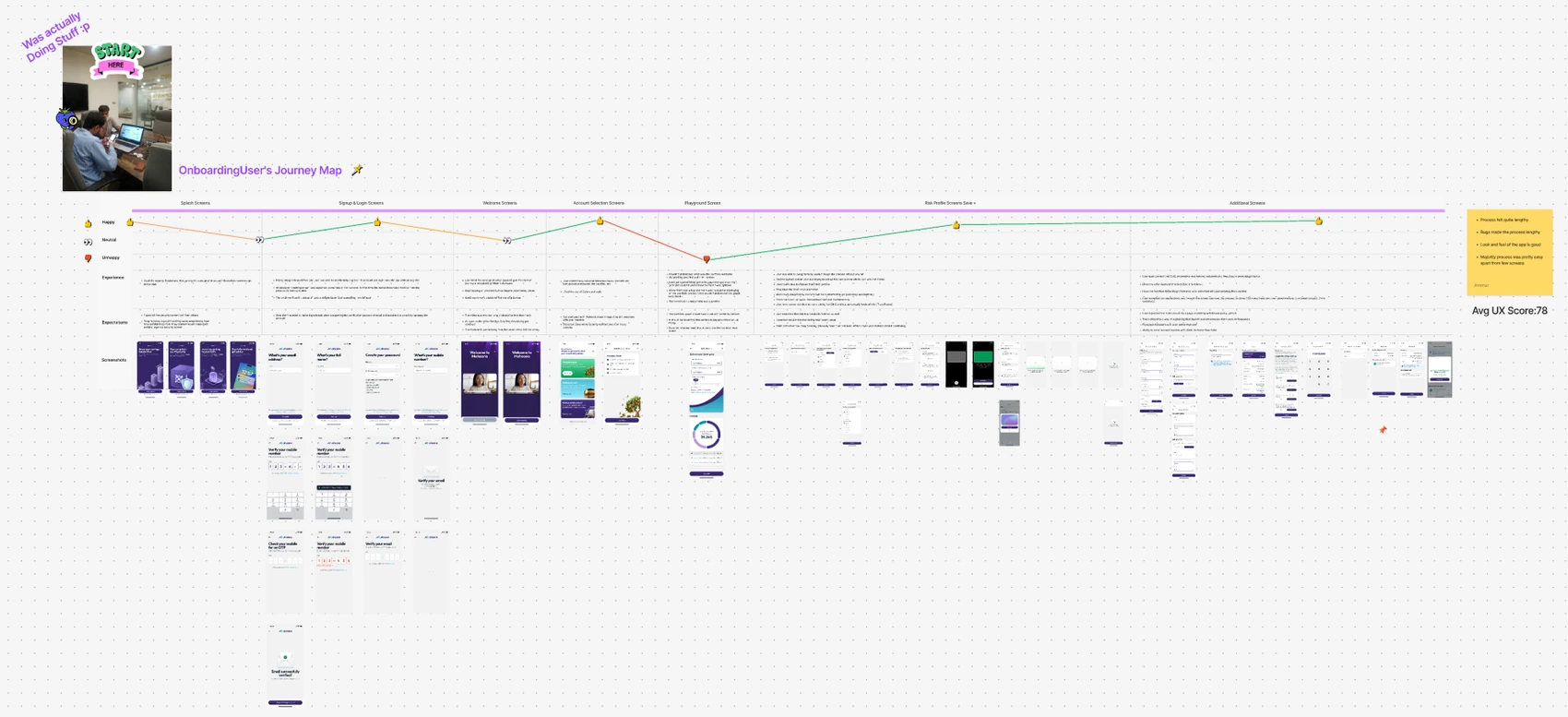
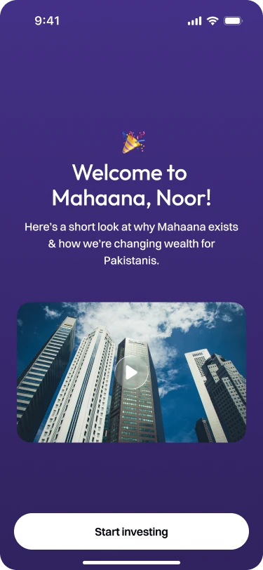
I started by testing the onboarding on the staging app with eight users. Feedback pointed to the length of the journey, with bugs adding further friction. The required checks had to stay, so I focused on reducing the effort within each step and explaining why we were asking.
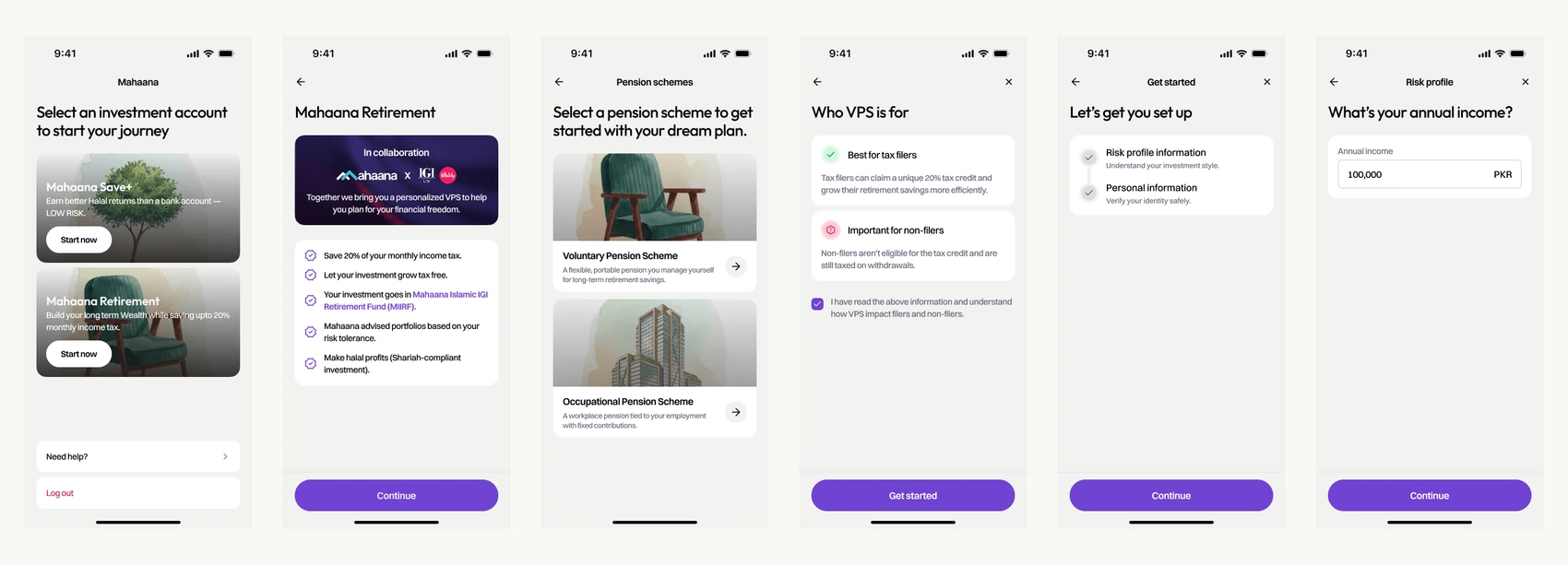
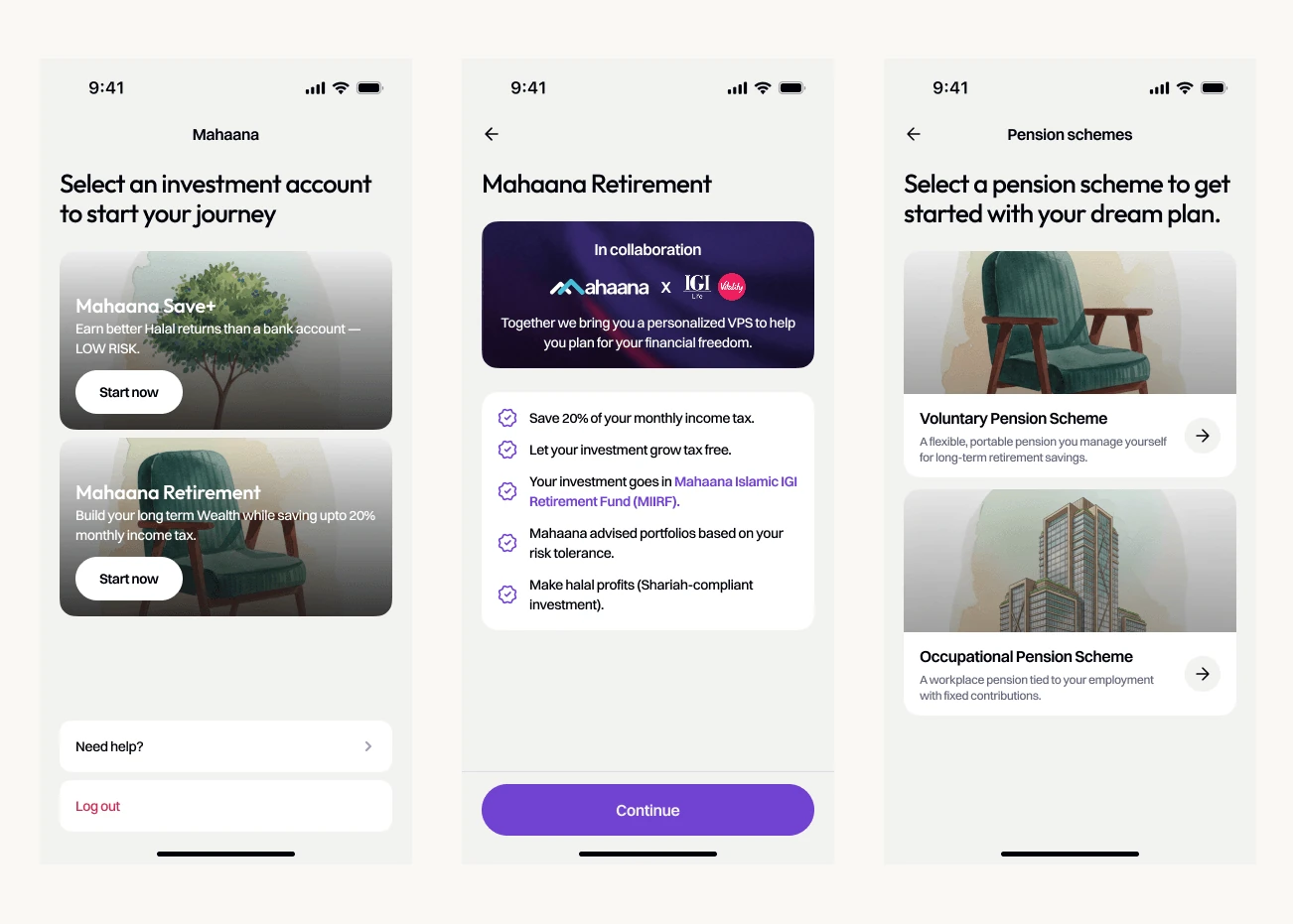
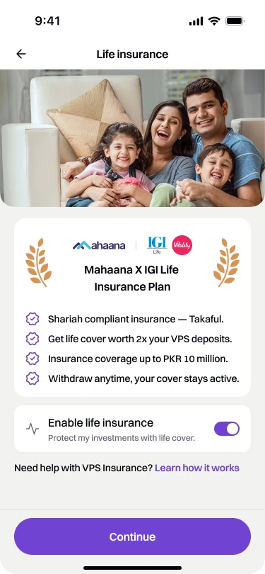
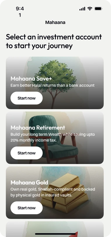
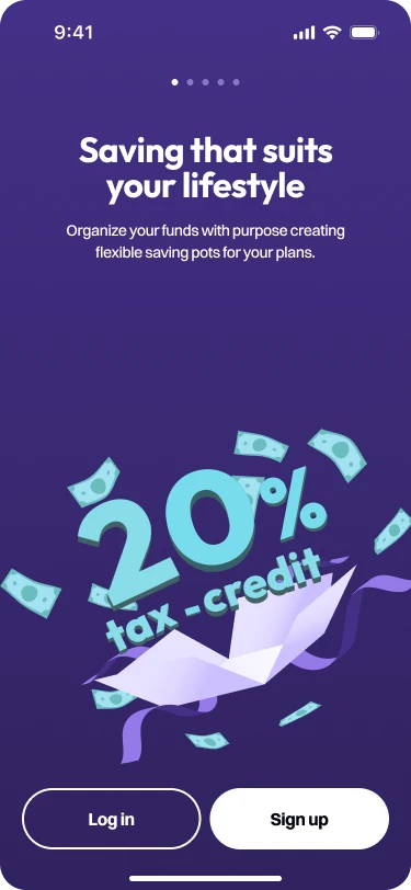
Product introductions gave customers context before a choice. Save+ connected to everyday saving; Retirement connected to planning ahead and potential tax savings. These explanations helped establish what each product was for before asking someone to commit to it.
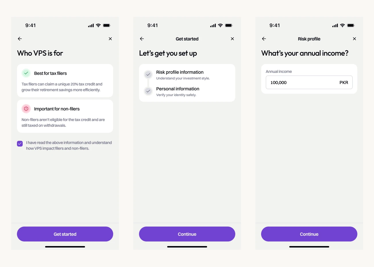
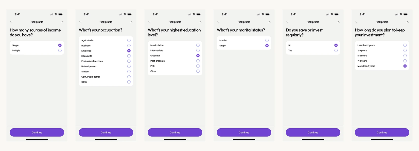
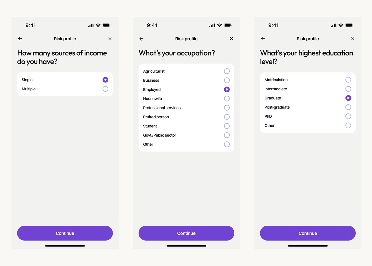
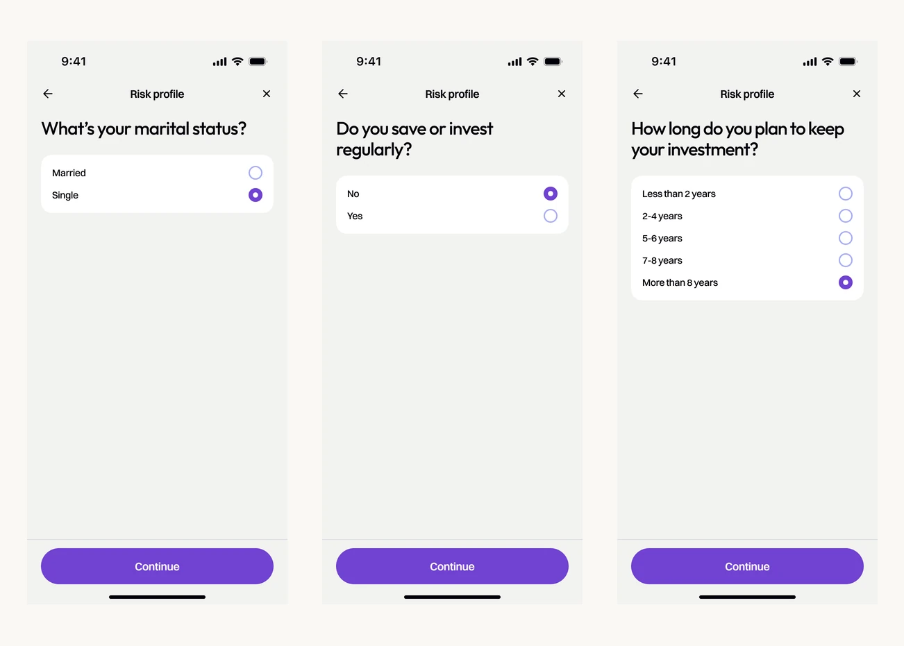
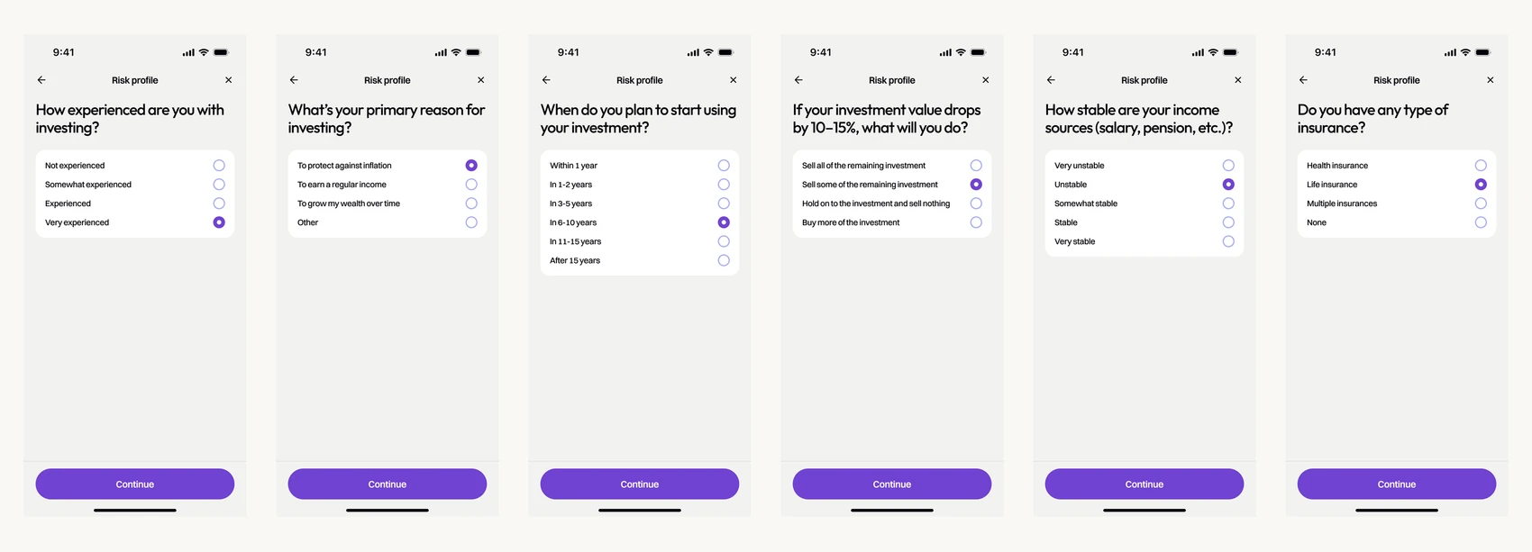
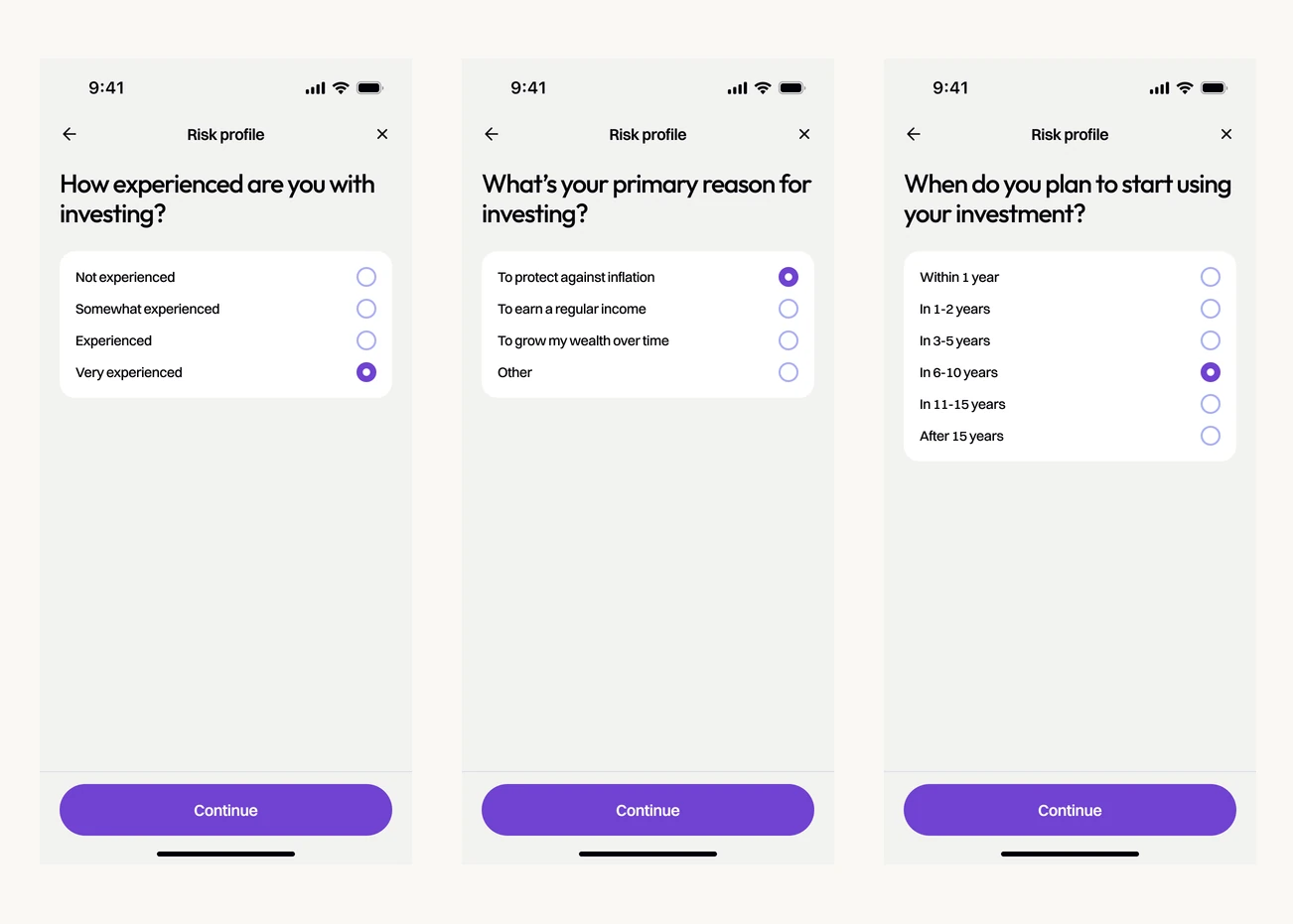
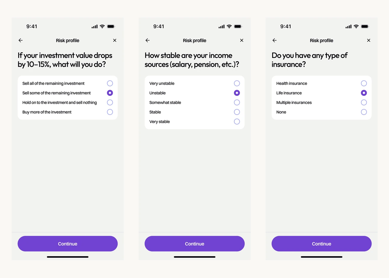
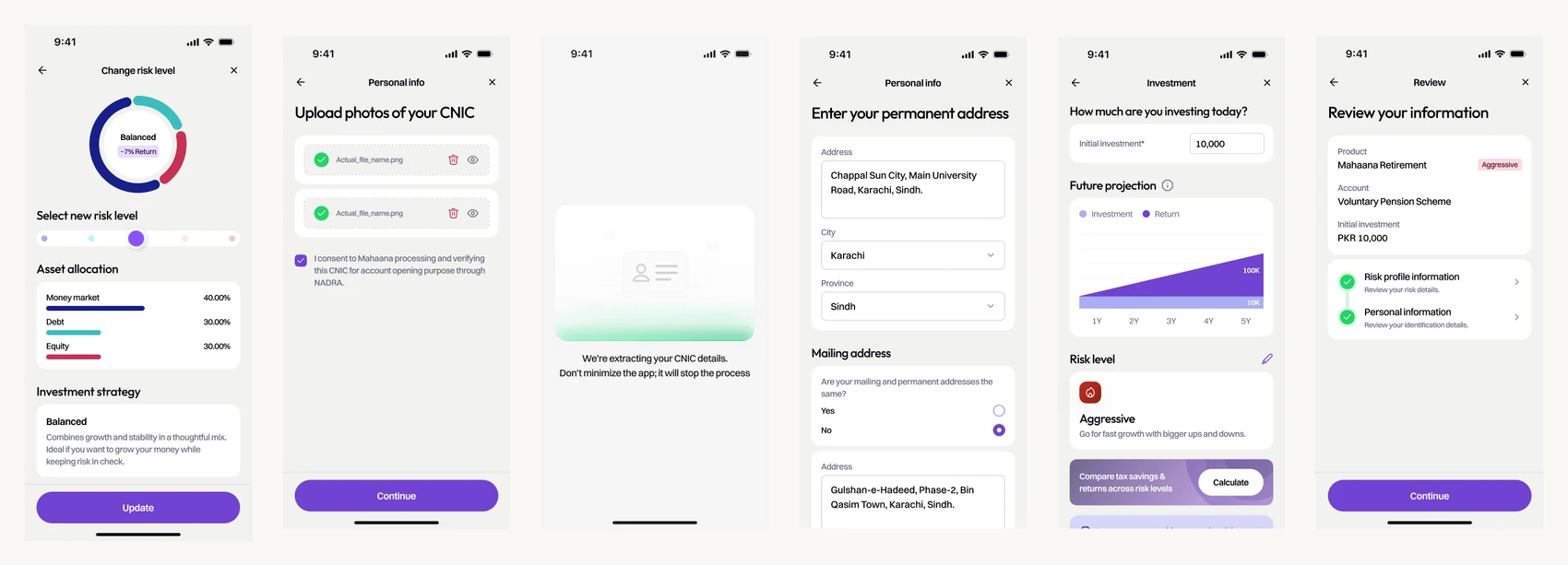
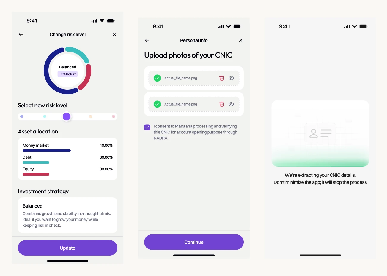
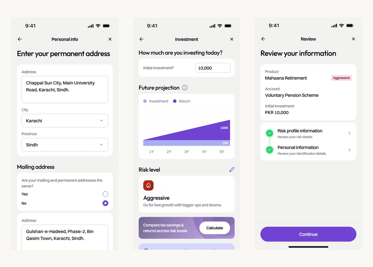
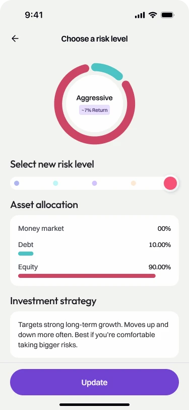
Risk profiling presented one question at a time, and ID card capture reduced manual entry. Once customers had answered the questions, they could see the recommended investment allocation and adjust it. That made the outcome of the questionnaire visible.
I also brought the first investment choice into onboarding. Opening an account was one milestone; helping someone use it was the larger goal. Choosing an investment during setup gave the journey a clear next step.
Account onboarding was reported at under five minutes. That figure covers account setup, rather than a completed, funded investment.
Put the money first
Once someone had invested, the home screen needed to answer the obvious question.
“How is my money doing?”
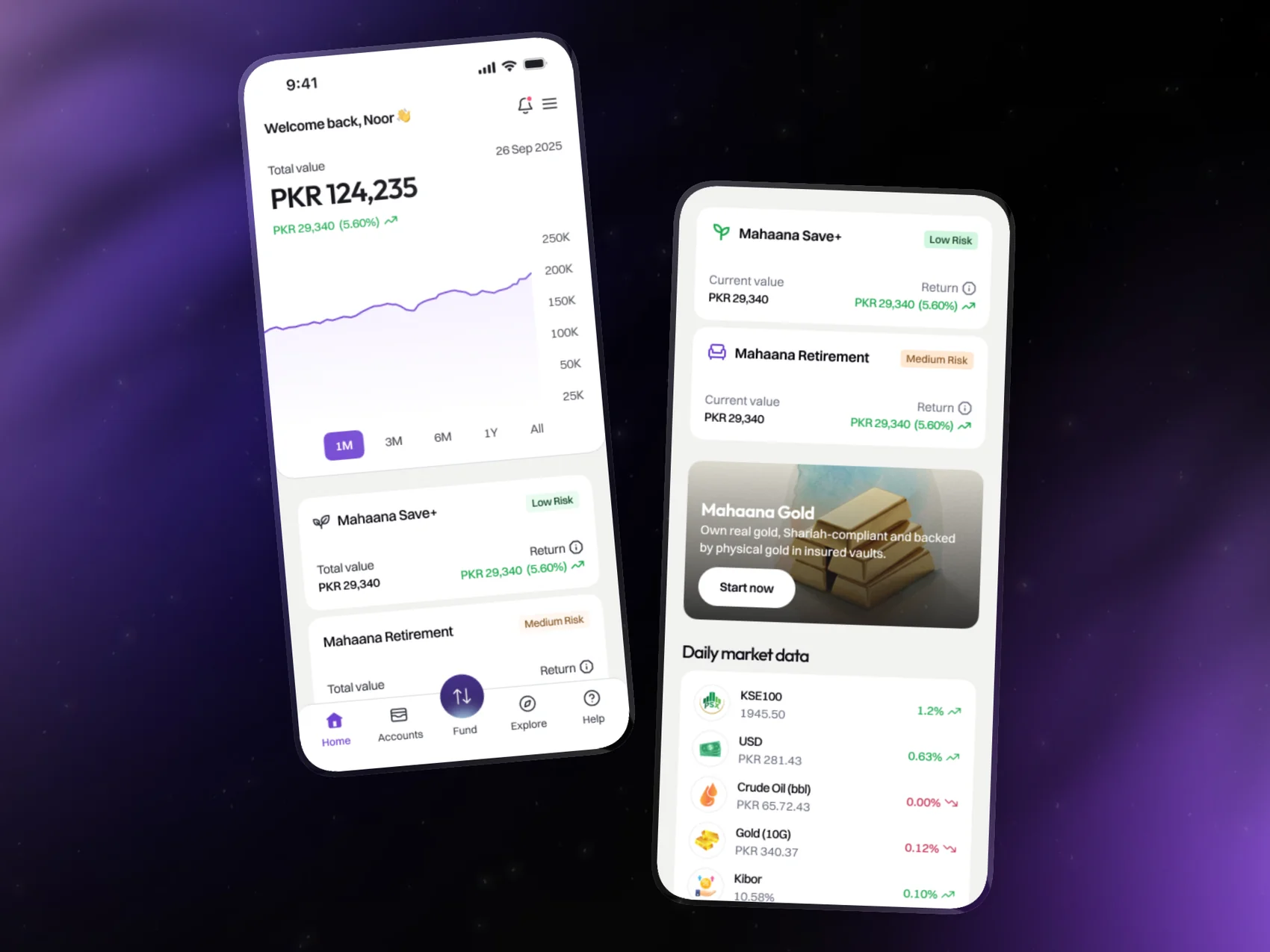
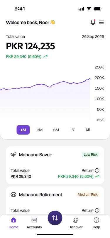
I placed total portfolio value and returns first, followed by a performance chart. Product cards showed where the money was invested, with the value, return and risk level of each holding. Customers could check the overall picture, then look more closely at a particular investment.
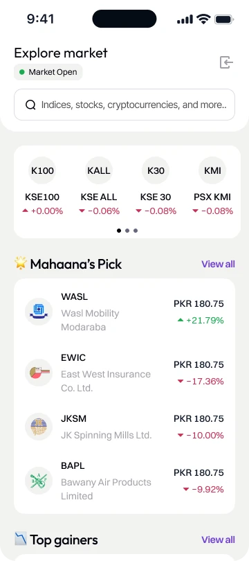
Market information, educational content and access to a Wealth Advisor followed below. The order reflected the task: check your money first, explore or ask for help when you need to.

Give people a way to learn
Onboarding could introduce the products, but customers would continue to encounter unfamiliar terms and market movements after investing.
 2 December 2022Making our children financial literateOnly 26% of adults in Pakistan are financially literate. The authors argue for teaching it in schools, so the next generation grows up with the basics.Read on dawn.com ↗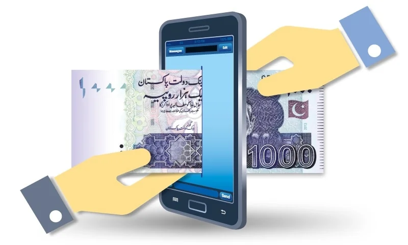
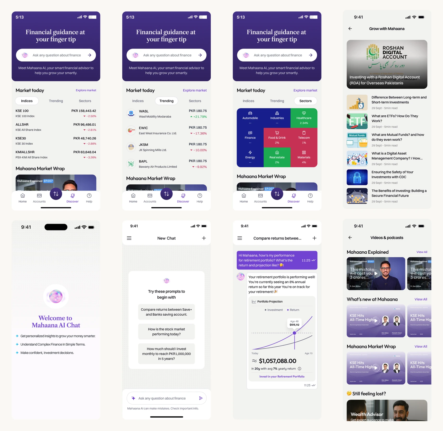
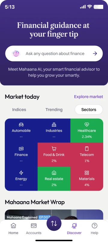
Discover brought market snapshots, educational videos, articles, news and a plain-language chatbot into the app. It gave customers a place to build their understanding alongside managing their investments.
Build the pattern before the next product
Mahaana’s product range was expanding. I built shared components, tokens and interaction patterns so each addition could fit into an experience customers already knew.
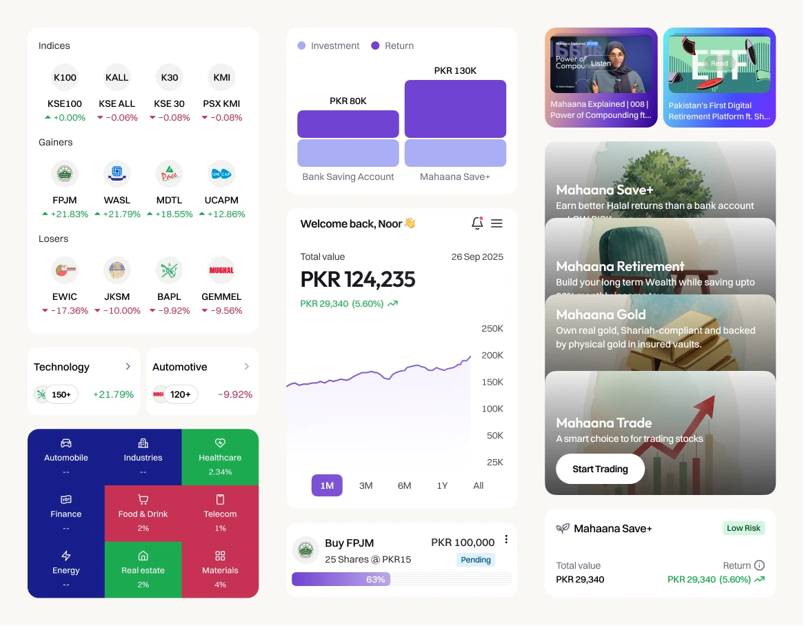
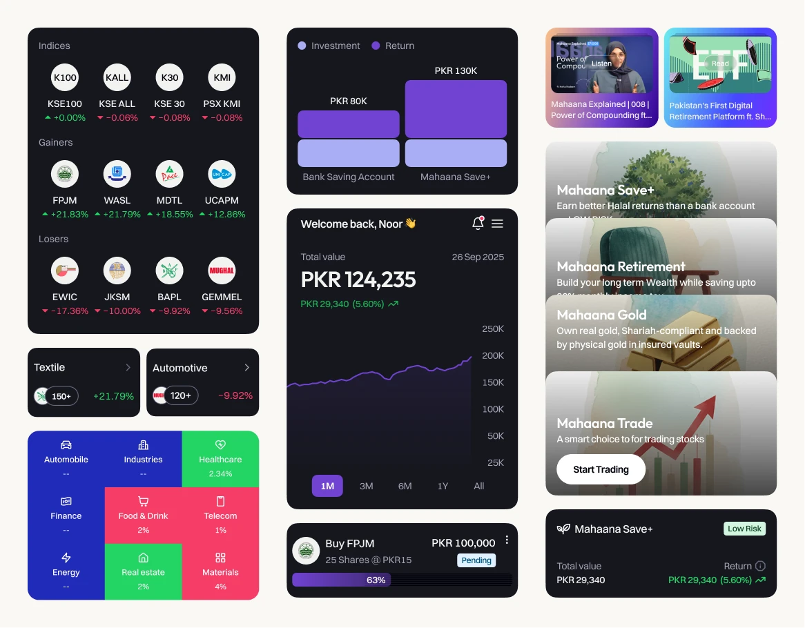
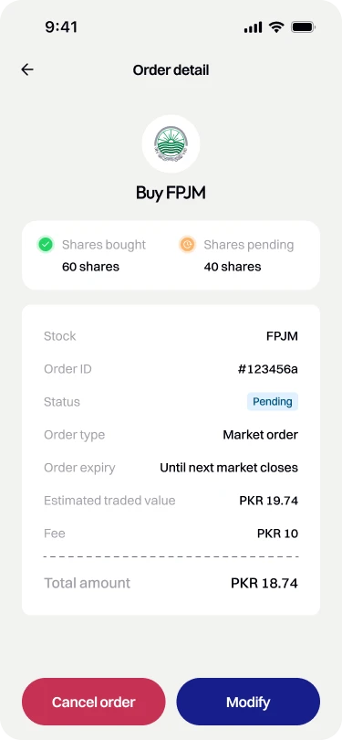
The product-card pattern was established before gold and trading were introduced. It gave the team an existing structure for presenting new offerings, including their value, returns and risk. Light and dark colour tokens, defined spacing and documented component states also made implementation more consistent.
The team reported a 35% reduction in design-to-development handoff time. Shared specifications helped reduce repeated questions about how components should look and behave.
What the work supported
Mahaana reached 50K+ registered users, 10K+ app downloads and 20K+ active clients. Those figures reflect the work of the wider company. My contribution was the mobile experience and design foundations supporting those customers as the platform grew.
The reported delivery outcomes were account onboarding in under five minutes and a 35% reduction in design-to-development handoff time.
Reflection
Working on Mahaana taught me to treat customer questions as part of the interface. Explaining why we needed an answer, what a recommendation meant and where someone’s money would go deserved as much attention as the transaction itself.
I’d bring compliance into the first sketches next time. Some Shariah explanations came after the product had taken shape; discussing them earlier would have helped us resolve the flow and language together.
The design system was another lasting lesson. As the product range grew, shared patterns helped the team build on existing decisions and gave customers a familiar way to navigate new offerings.
“Ammar understood the questions first-time investors needed answered and made them central to the mobile experience. He also built a design system that helped our team introduce new products while keeping the app consistent and easy to follow.”