Iconimate
Small icons. A lot of decisions.
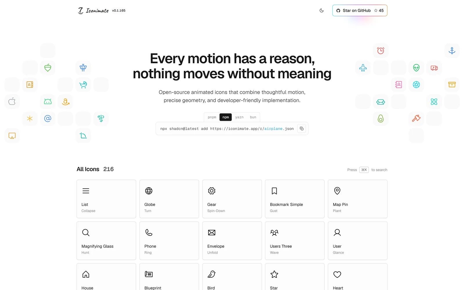
Iconimate is an open-source library of animated React icons built on Phosphor. I designed the motion, built the components and published the website, turning a personal experiment into a tool other people can use.
My role
An independent project, 2026 to present. I designed the motion for every icon, built the React components and published the website, where developers can search the set, preview each animation and install the icons they need.
Iconimate is an MIT-licensed library of 216 animated icons built on Phosphor’s glyphs. It has 45 GitHub stars and was featured on DEV.to’s social media. Figures as of September 2026.
Services
Tools
I kept rebuilding the same icon
Iconimate started as a small annoyance in my own work. I’d need one animated icon, so I’d build it by hand in Motion, and it never quite matched the rest of my icon set. The stroke weight was slightly off, the optical size a little different, and the timing judged by eye every time. One icon was fine. Ten, and I’d lost a day to something that should have taken five minutes.
The ready-made options didn’t fix it. The good animated sets were paid, and the free ones were small, so I’d find the few icons I needed and none of the rest. Most were also drawn on their own grid, so next to the icons I already used they looked almost right, which is harder to live with than clearly different.
Consistency was only half of it. An animation can look good on its own and still feel out of place in an interface. Different timings make icons feel unrelated. Too much movement makes them distracting. Details that read clearly in a large preview can disappear inside a small button. And even a good icon only helps if it’s quick to add to a project and easy to adapt.
- build one consistent library of animated icons, instead of relying on paid sets or the few limited free ones?
- make adding an animated icon to a project as easy as copying one line?
One library that moves like a family
Start with the object
Every icon starts from Phosphor’s glyphs on its 256 grid, so Iconimate sits beside an existing Phosphor set with the same stroke weight, optical alignment and density. My work was the motion: which parts move, where they pivot and how they settle. A bell swings from its crown and an anchor sways from its ring, while shared timing and easing keep those different movements feeling like one set.
Protect the resting state
At rest, every icon had to match its original Phosphor glyph, so it could sit beside static icons without changing an interface. That rule also settled choices: for the beer stein, I shipped a version that moves the whole mark instead of the lid-flip I explored, keeping the original path intact.
Build variations, then choose
For the baby carriage, I built seven candidates, from a simple pop to rolling, rocking and canopy movements. Side by side, it was clear where the motion should start, how much was enough and how it should return to rest. The suspension bounce won: the body drops, the canopy follows and the tyres stay planted.
Test at the size that matters
I compared every animation at 16, 20, 24, 32 and 48 pixels, with 24px as the reference. At that size a rotation can hide the shape and a delay can make the movement feel disconnected, so anything that only worked in the larger preview went back for another pass.
Easy to add to any project
Preview, install and control each icon
A consistent set only helps if it’s quick to use. In the searchable gallery, people preview each animation, then install just that icon through the shadcn CLI, with its source in their project to adapt and no package to add. They can also copy the code, or a prompt that has an AI tool rebuild it. Each component exposes animation controls too, so the motion can follow a parent button, a card or a tap on a touch screen, where hover never fires.
Put it out into the world
The collection has grown to 216 icons and received 45 GitHub stars. It was also featured on DEV.to’s social media, giving the project recognition beyond my own channels. These are early signs of interest. Understanding how people use the icons in their products is the next step.

Reflection
Iconimate became a practical way to improve at design engineering. I had to take responsibility for the whole experience: how an icon moved, how the component behaved and how someone would find and install it.
The strongest decisions came from comparing alternatives. Building seven versions of an icon gave me a clearer reason for choosing one. Constraints such as preserving the original glyph and checking movement at 24px helped me decide when an animation was ready.
Next, I want to gather feedback from developers using Iconimate in real interfaces. That will help me decide which icons to add, which behaviours to refine and where the installation experience needs work.